
Page 20 - 2025S
P. 20
UEC Int’l Mini-Conference No.54 13
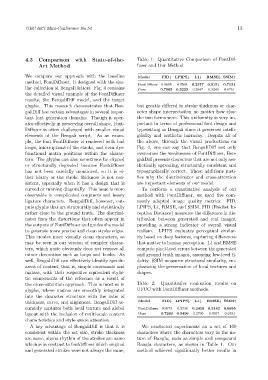
4.3 Comparison with State-of-the- Table 1: Quantitative Comparison of FontDif-
Art Method fuser and Our Method
We compare our approach with the baseline Model FID↓ LPIPS↓ L1↓ RMSE↓ SSIM↑
method, FontDiffuser. It designed with the sim-
0.3568
ilar collection of Bengali letters. Fig. 4 contains FontDiffuser 0.8685 0.3223 0.2377 0.3151 0.7131
Ours
0.6751
0.2547
0.3240
0.7063
the detailed visual example of the FontDiffuser
results, the BengaliDiff model, and the target
glyphs. This research demonstrates that Ben- but greatly differed in stroke thickness or char-
galiDiff has certain advantages in several impor- acter shape interpretation no matter how close
tant font generation domains. Though it oper- the two forms were. This uniformity is very im-
ates effectively in preserving overall shape, Font- portant in terms of professional font design and
Diffuser is often challenged with smaller visual typesetting in Bengali since it preserves intelli-
elements of the Bengali script. As an exam- gibility and aesthetic harmony. Despite all of
ple, the font FontDiffuser is rendered with bad the above, through the visual productions on
loops, interruptions of the stroke, and even dys- Fig. 4, one can say that BengaliDiff not only
functional matra positions within the charac- overcomes the weaknesses of FontDiffuser, Ben-
ters. The glyphs can also sometimes be clipped galiDiff presents characters that are not only aes-
or structurally degraded because Fontdiffuser thetically appealing, structurally consistent and
has not been carefully monitored, so it is ei- typographically correct. These additions justi-
ther blurry or the stroke thickness is not con- fies why the discriminator and cross-attention
sistent, especially when it has a design that is are important elements of our model.
curved or running diagonally. This issue is more To perform a quantitative analysis of our
observable in complicated conjuncts and heavy method with FontDiffuser, we used five com-
ligature characters. BengaliDiff, however, out- monly adopted image quality metrics: FID,
puts glyphs that are structurally and stylistically LPIPS, L1, RMSE, and SSIM. FID (Fréchet In-
rather close to the ground truth. The discrimi- ception Distance) measures the difference in dis-
nator fixes the distortions that often appear in tribution between generated and real images,
the outputs of FontDiffuser and guides the model providing a strong indicator of overall visual
to generate more precise and clean stroke edges. realism. LPIPS evaluates perceptual similar-
This creates more visually clean characters, as ity based on deep features, capturing differences
may be seen in our version of complex charac- that matter to human perception. L1 and RMSE
ters, which quite obviously does not remove all compute pixel-level errors between the generated
minor decoration such as loops and hooks. As and ground truth images, assessing low-level fi-
well, BengaliDiff can effectively identify specific delity. SSIM measures structural similarity, em-
areas of content, that is, simple consonants and phasizing the preservation of local textures and
matras, with their respective equivalent stylis- shapes.
tic components of the reference as a result of
the cross-attention approach. This is most so in Table 2: Quantitative evaluation results on
glyphs, where matras are smoothly integrated UFUC with FontDiffuser methods.
into the character structure with the ratio of
thickness, curve, and alignment. BengaliDiff ac- Model FID↓ LPIPS↓ L1↓ RMSE↓ SSIM↑
curately captures both local texture and global FontDiffuser 0.9573 0.3738 0.2419 0.3142 0.6855
layout with the inclusion of multi-scale content Ours 0.7280 0.3406 0.2706 0.3357 0.6491
characteristics and style-aware attention.
A key advantage of BengaliDiff is that it is We conducted experiments on a set of 100
consistent within the set size, stroke thickness characters where the characters vary in the na-
are same, sigma rhythm of the strokes are same ture of Bangla, such as simple and compound
which is in contrast to fontdiffuser which original Bangla characters, as shown in Table 1. Our
and generated strokes were not always the same, method achieved significantly better results in